Styles, light and dark mode, and your brand color for the chat widget.
Experience is where you set how the widget looks and feels. Open Experience from the top navigation. A live preview sits next to the controls so you see every change as you make it.
Styles
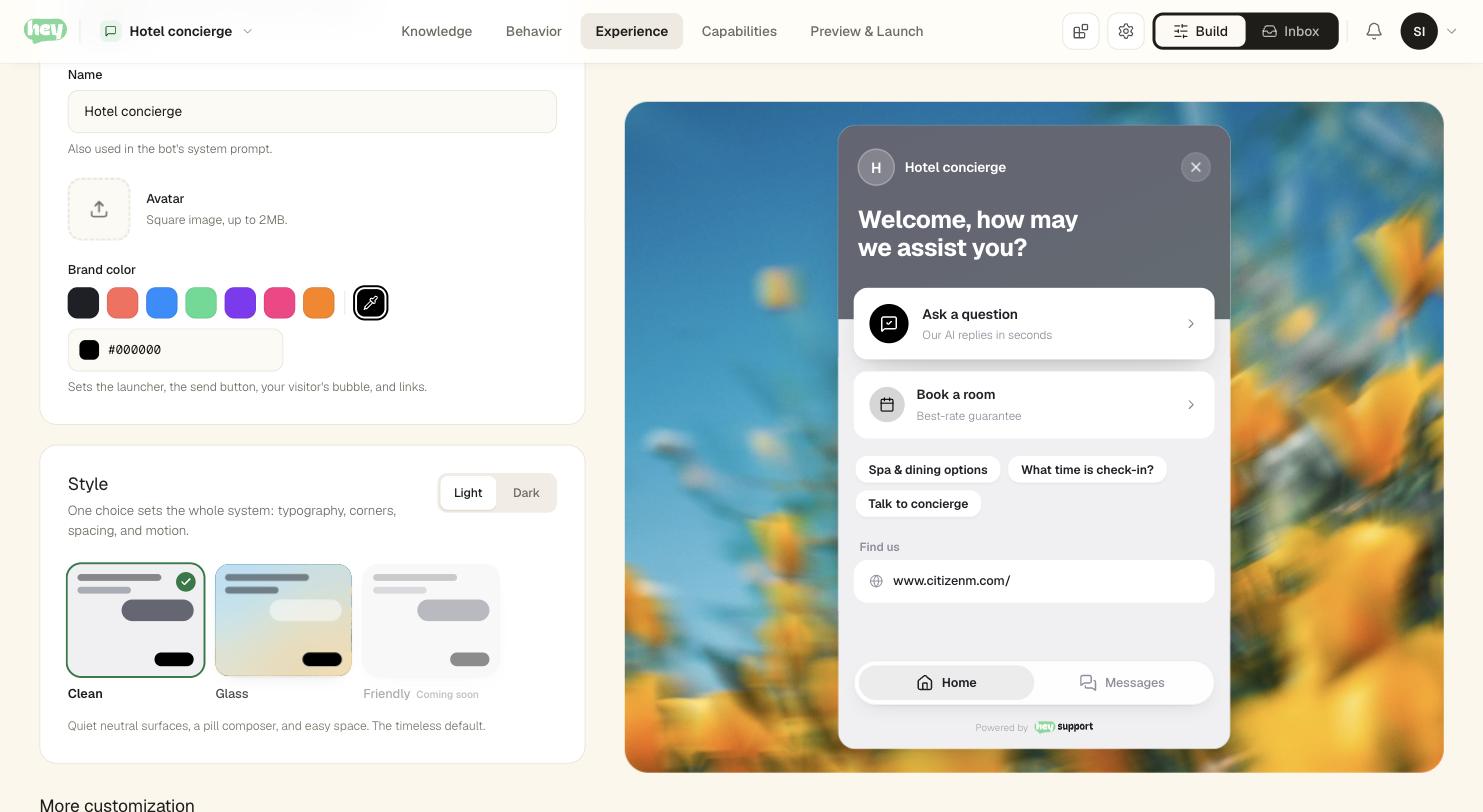
Start from one of three styles. Each is a complete look — shapes, type, spacing, and motion:
- Clean is a quiet neutral look with a pill composer and easy space. It is the default and works almost anywhere.
- Glass uses translucent surfaces that let your site show through behind the conversation.
- Friendly rounds every shape and switches to the Nunito typeface for a warmer, approachable feel.
Every style comes in Light and Dark — flip between them with the toggle beside the style tiles. The preview tiles render with your actual brand color and mode, so what you see on the tile is what deploys.
Brand color
Your Brand color is one hex value that recolors the whole widget: the send button, action buttons, the visitor's message bubble, and the text tints all derive from it automatically. Pick a swatch or enter any hex.
Everything derived from your brand color picks readable text automatically — light accents carry dark text, dark accents carry white — so you never end up with pale text on a pale button. Backgrounds and surfaces stay neutral so the conversation always reads clearly.
Picking a style never changes your brand color, and changing your brand color never changes the style. The two are independent.
The rest of Experience
Appearance is one part of Experience. The other pages cover:
- Identity and launcher: the widget's name, subtitle, avatar, and the button that opens it.
- Messages and prompts: the opening message and suggested prompts.
- Home screen: the rich home tab.
- Sound and voice: audio feedback, and where the Voice Assistant lives.