Most chat widget design starts from the same kit: a rectangle in the corner, a colored header bar with the company name in white, a cheerful greeting, an input at the bottom. Visitors treat these widgets like popups because they look like popups. Same silhouette, same reflex, straight to the close button. We rebuilt the Hey Support widget this year, and the brief I gave myself was one line: make the thing people do not reflexively close. What follows are my field notes from that work, including the part we shipped to production and later deleted.
The header band had to go
Nearly every chat widget has a header band for the same reason nearly every dashboard has a left sidebar: the first one did. The band takes the top 70 or so pixels of a panel that is only about 700 tall. It holds a name, maybe an avatar, maybe a subtitle. Then it sits there for the rest of the conversation, being a colored rectangle. It is also the loudest possible signal that the thing you are looking at is a marketing object, because banners are what marketing objects have.
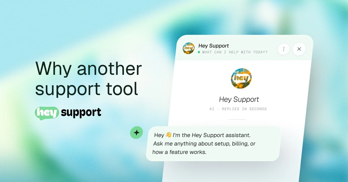
So we removed it. Identity became a small floating pill at the top center: avatar, name, and a presence dot when a person is actually available. Controls became round glass buttons in the corners, one each for back, menu, expand, and close. (The expand choice sticks across visits: someone who wanted the bigger panel yesterday still wants it.) The conversation scrolls edge to edge, all the way up, sliding under a soft blur that keeps the pill readable without drawing a line across the panel. On phones the same panel becomes a bottom sheet with a drag handle, and the corner buttons stay where thumbs already are.
The reasoning fits in a sentence: the content is the interface. Messages are what the visitor came for. Everything else is chrome, and chrome belongs floating above the conversation rather than boxing it in. Forty messages into a support thread, nobody needs a permanent banner reminding them whose website they are on.
The presence dot earns its pixels, by the way. Knowing whether a human is around changes how people write, and whether they wait. There is a whole post about that seam in live chat vs chatbot.
A composer that grows with the message
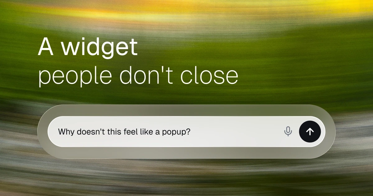
At rest, the composer is a one-line pill: the input, a send button, a mic when voice is enabled. Type a short question and it stays a pill. Cross onto a second line, or press shift and enter, and it morphs into a card: text area on top, actions in a row underneath, capped at five lines before the text scrolls inside.
The visible part of that morph took about a day. The invisible part took much longer: the input element never moves in the DOM. The pill and the card are the same field, with the controls absolutely positioned around it, and only the shell changes. Rebuild the input mid-morph and focus drops for a frame, the cursor jumps to the end, and on phones the keyboard flickers or closes outright. Nobody files a bug titled "the keyboard blinked". They just conclude the widget feels cheap and stop typing. This is the kind of boring detail nobody notices until it is wrong, and even then they do not notice it. They leave.
The growth itself is measured in JavaScript rather than left to a newer CSS property, because the newer CSS property does not exist on every browser people actually use. Less elegant, works everywhere. That tradeoff shows up constantly in widget work: the embed runs on sites you do not control, on devices you did not pick, so boring reliability beats clever.
One small state change pulls real weight: the send button sits muted until there is something to send, then takes the accent color. It reads as "ready" without a tooltip.
Motion that knows when to stop
Early builds animated every message, including history. Open the widget and twelve old messages would cascade in like it was their first day. It demoed beautifully. It felt wrong within an hour of real use.
The rule we landed on: entrance animation is information. It should mean "this just happened". New messages animate in. Everything that already existed renders settled, instantly. When a returning visitor resumes yesterday's conversation, the thread is simply there, like an inbox, and only the next reply moves. Each theme gets its own entrance, a soft rise on the round themes, a plain fade on the sharp one, but the rule about when to play it never changes.
Two related rules. Reduced motion gets the finished state; a slower version of the same choreography would miss the point of the request. And nothing moves on hover. We used to lift elements by a pixel on hover across the whole product, and this summer we removed every instance of it in favor of a slight darkening. Movement without meaning is noise, and a chat panel accumulates a lot of hovers. The same thinking runs in reverse on phones: controls that would reveal on hover stay faintly visible on touch screens, where hover is a rumor.
The typing indicator, for the record, is an avatar and three dots. It does not need a shimmer or a personality.
Text on any accent color
Operators pick the accent color. That is the deal with an embedded widget: our component lives inside their brand, and the color picker is theirs. Most widgets handle this by hardcoding white text on the accent and hoping.
Someone always picks yellow.
So the widget computes the text color from the accent instead of assuming white will survive. Dark ink lands on light accents; white appears only where white actually passes contrast. The same rule covers the send button, the suggestion chips, and links on tinted surfaces. Operators see the result live in the preview before saving, which turns an argument about brand color into a look at the actual pixels. Contrast that survives customer branding is the only kind worth shipping in a product where the customer holds the color picker.
Quiet by default
A chat widget that makes noise is claiming attention from the corner of a page someone came to read. Our bias is silence. Support widgets get opened in offices, on buses, next to sleeping kids; default quiet is just manners. Sound never turns itself on. Turning it on is a deliberate operator choice, and the themes are tuned soft for when it is. Feedback runs on one channel at a time, a small haptic tick or a small sound, never both stacked. The moments that get feedback at all are few: a message sent, a message arriving, the panel opening. A hover is not an event.
And when the browser blocks audio until the visitor interacts, which most do, the widget fails silently. A sound effect is never allowed to hold up a message.
The version we deleted
Version two of this widget had a header band. Designed, built, shipped to production, used by real visitors. It was fine. Fine was the problem. Next to the prototypes it looked like every other widget on the internet, and after enough side-by-side staring we admitted the band itself was what kept it feeling like a popup. Refining it further would have meant polishing the wrong object.
So we deleted shipped work and rebuilt the top of the widget as the floating chrome described above. Deleting your own production code stings, and I would like to report that we did it quickly and without discussion. We did not. But keeping it would have cost more, and the delete is the part of this redesign I am proudest of.
The storefront window
A widget is the one piece of your product that renders on someone else's site, next to someone else's typography, in front of someone else's customers. For a store, it more or less is the storefront window: the glass, the handle, the way the door swings. People judge the store by it before they have read a word of your copy.
Design gets the door open. What the bot says first does the rest, and that is a writing problem more than a visual one; Prairna collected the patterns that work in chatbot welcome messages. The rest of what the widget does, themes, languages, handoff, lives on the features page.
Nobody praises a chat widget. The best review it can get is that people typed.